Data Visualization
Charts with a point of view
A selection of visual stories where I took a question, found the data, and designed a way to see the answer.
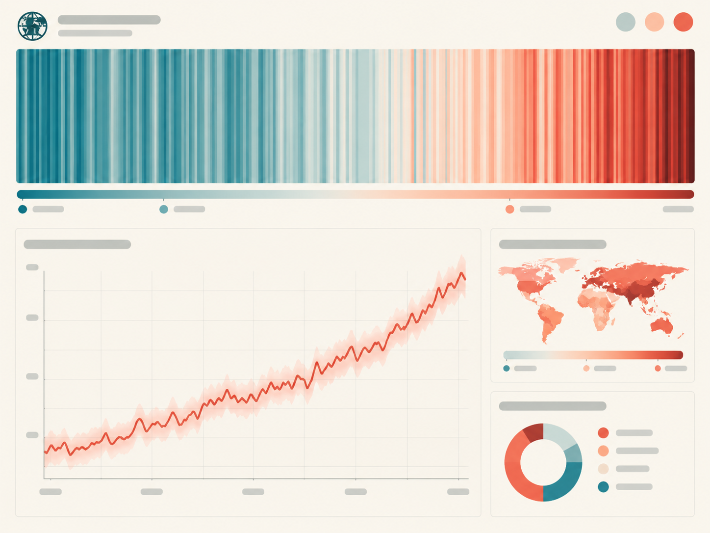
Hotter Every Year
An interactive scrollytelling piece exploring 140 years of local temperature records, built around a reimagined warming-stripes chart.
- D3.js
- Svelte
- NOAA data
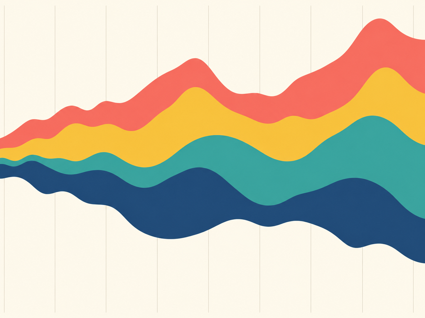
The Sound of Decades
A streamgraph tracing the rise and fall of music genres on the Billboard Hot 100 from 1960 to today, with hover-to-listen snippets.
- Python
- Observable Plot
- Spotify API
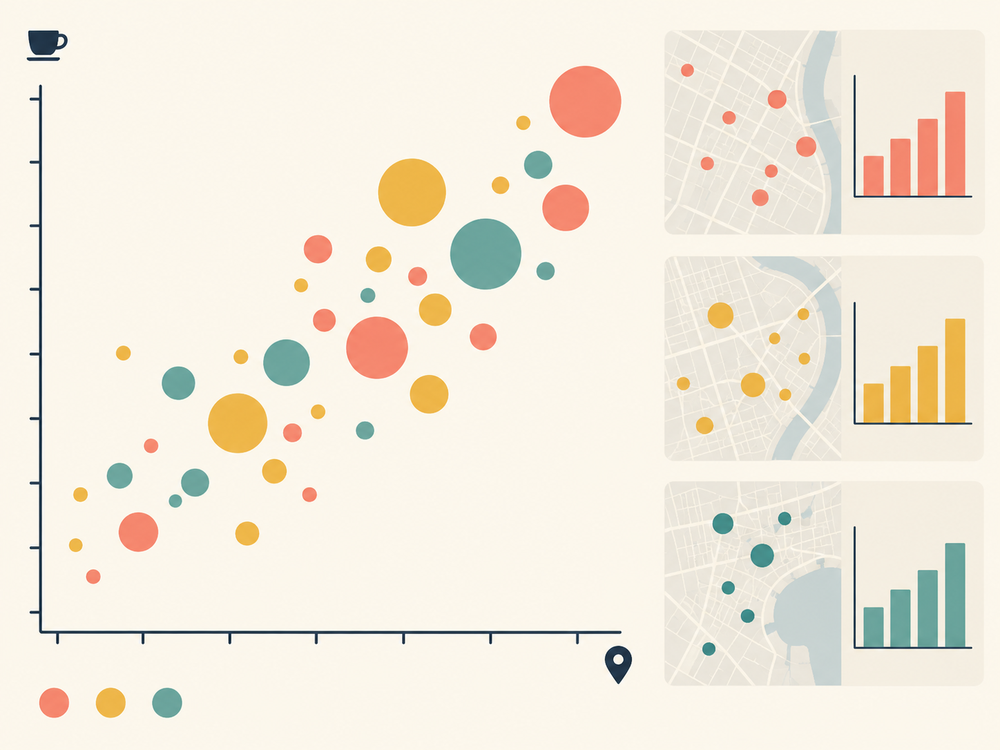
Latte Index
Mapping the price of a latte across 200 neighborhoods to explore how coffee costs track rent, income, and gentrification.
- R
- ggplot2
- Tableau